Walking Reflection — November 4

A digital collage blending red, gold, and pink autumn leaves with soft branches and floral forms. The composition feels like a playful romp with color, echoing the joy and energy of fall.
Autumn Layers — digital collage inspired by the color and rhythm of autumn.

Autumn Colors

This fall, on my walks, I’ve been amazed by the color — soaking it in, just appreciating the ability to gaze upon such beauty.

As beautiful as the colors of spring and summer are — spring with its bright yellow-greens and lupines in pinks and violets, and summer with its deeper greens and the bright yellows of marigolds or the reds of geraniums and pinks of coneflowers — not to mention the purples and blues of delphiniums — I love them too.

But autumn colors speak to me differently. There’s an excitement, a passion in them that touches my soul.

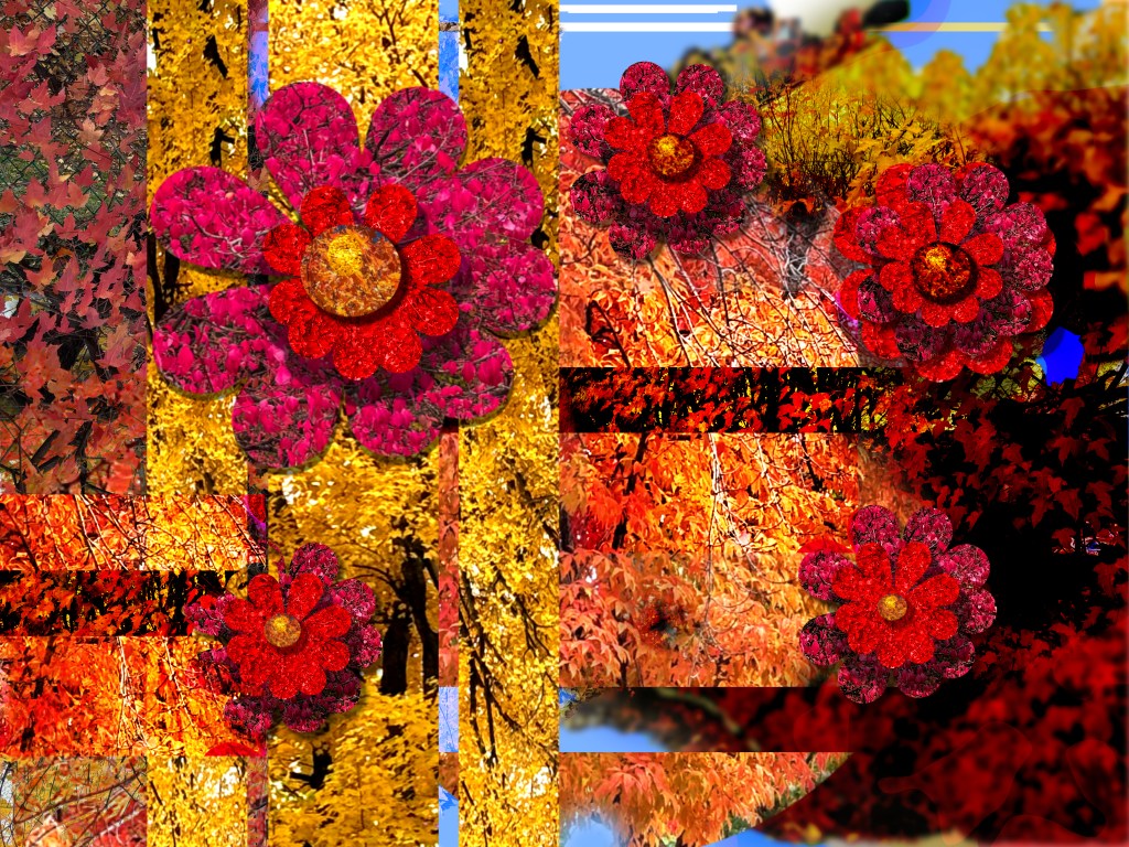
I often collect leaves and set them in my studio to inspire me — to try and equal the wonderful harmony of fall colors. This year, I decided to play as the Creator once did, and create an image — a playful collage of color, built from photographs taken along the way.

Bill Hendricks


Started with a Walk and a Photograph

Related: Minnesota DNR Fall Color Finder — a live map of color across the state and information about the 2025 season.

Putting it out there… That is what an artist does.

Every artist writes his own autobiography.
                                             ~ Havelock Ellis

Putting it out there… That is what an artist does. I am realizing that more and more, I am writing my autobiography. An artist does put it all out there.

Quakers (the Religious Society of Friends) has been taking more of my time lately. I just finished the Northern Yearly Meeting eNews for July. For the past few years, I edited and produced the eNews for the yearly meeting.

For most of my writing now, I am using Grammarly. Yes, it is AI, and since I am dyslexic, it is very helpful. However, there are still mistakes, mostly because of reading errors. I get impatient and skim. I found that it is not good for proofreading. I am considering writing more about my life, but I don’t know how open I want to be. 

Derwent Inktense pencils and blocks have captured my attention as a new medium, and I am playing with them in combination with other materials that I am comfortable using. Applying the Inktense color with a brush was a concern because it has been quite a while since I last used watercolor or a brush. After playing with them, have a handle on the ink, but not a tight grip. : ) My pen work over the last couple of years has been beneficial.

I think of my friends Joe Sinness and Andrea Carlson, artists who are adept with wet media and can create sharp lines and crisp edges. 

I am drawing more and finding it rewarding—it allows me to center, and it is a meditative practice for me. Over the last few months, I have created three or four new pieces.

Below is a fun and quirky piece I created by playing and experimenting with Derwent Inktense pencils and my pens.

IMG_4582-Color Study 06202024

What for? How come?

Color is like cooking. The cook puts in more or less salt, that’s the difference! ~ Joseph Albers, (Sensational Color)

Color Swatches done with ink and  colored pencil
Teaching Color is not Akin to doing Color, Hendricks © 2020 

Concerned with the practical intent, I mean by choosing a width of a pen, or the softness of a pencil, or the shade and color of a pencil and how it reacts to a substrate. I set about doing a series of studies using the media that I am fond of at this moment. I stumbled into some articles discussing the intent of the artist. Yes, the intent of the artist is important, but… is it important to the audience. Does the work have to be explained by the artist? 

I know why I am drawing and studying the various software that I am, but I am on a path… and as a great hike, I don’t know the adventures, disappointments, wonderful sights, and joys  I will enjoy along the way. I know that in some way, it is a spiritual quest, one that will give me insights both in the conscious and unconscious realms.  

Whether or not it is important, I have to reveal; I believe in something, maybe you can call it God, that is up to you. That belief and my current self combines and presents itself in my artwork. If you have followed my work, you know that I have studied and learned to question what reality is, and I know that we as humans only experience a minute fraction of that reality actually is. For the moment, I am focused on Creation, Chaos, and Order and letting that present itself in my work, as feeble as my efforts might be to let that occur, I hope you both enjoy and allow yourself to explore what I see. 

Perception—No Brown

There’s no such thing as brown light! The color brown doesn’t exist in the external reality, but only in your internal reality: it’s simply what you perceive when seeing dim orange light against a darker background.

Max Tegmark, 
Our Mathematical Universe: My Quest for the Ultimate Nature of Reality;
Good Reads
Triangles, an image drawn by Bill Hendricks
Triangles, 5″ x 5″ Mixed Media, Hendricks ©2020t.

Still fascinated by Perception Vs. Reality

I have been doing a lot of work, surprisingly. I am still coping with learning the new media and focusing more on drawing with more control, as tempted as I am to use straight edges and drawing(technical templates). I believe a hand-drawn circle is more revealing about the artist and skill. Not that skill counts a lot, even if the world disagrees.

I suppose a bit of art speak is necessary at some point. If I have to put it in one word right now, I choose Creation, if I need to provide two words, Creation and Chaos. If I must give the reader three words… Creation, Chaos, and Order.

My friends tell me that the found paper I am working with isn’t such a good idea. They say it must be acid-free and have the ability to endure time. I understand their reasoning, and I guess to preserve the value of the work. I have two pieces of art that I did when I was very young, and when I open a drawer and see them, I think how beautiful it is that they are fading and turning a warm patina of age. By not worrying about the paper’s acidic nature, I feel I am embracing nature and time as Stefan Sagmeister did in his ‘Lisbon Billboard (2009).

I am archiving my work. Being that my drawings are small, that is easy. I have been digitizing them as well, building a body of work. I am having an opening of sorts on Second Life tomorrow.

Stay healthy… Thanks for reading,
Bill